blog
What We See That You Don’t: The unseen complexity behind truly intuitive wayfinding
Jul 8, 2026

Most people think of an interactive map or kiosk as a simple digital tool; touch, search, find your way. But those of us who live and breathe wayfinding see something entirely different.
We see micro-decisions that shape how people move; how the angle of a corridor can distort direction, how the tilt of a map changes confidence, how milliseconds of lag can erode trust.
The best systems feel effortless. But that ease is engineered, not accidental. It’s the result of data, design, and empathy working together, invisibly.
We see cognitive friction where others see clarity.
A map can look clean and still feel confusing. That’s because clarity isn’t visual, it’s cognitive.
Every pathway, label, and icon competes for mental bandwidth. We study where people pause, where their eyes hesitate, where their fingers drift on touchscreens. Each hesitation tells us the mental model isn’t aligned.
So we refine spacing, orientation, hierarchy, until wayfinding becomes intuitive rather than instructional.
Good design helps you understand your surroundings. Great design makes you feel like you always did.
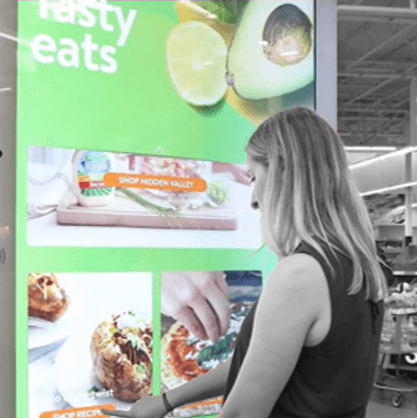
We see orientation as emotion.
Wayfinding is more about confidence than coordinates. It’s not just about getting somewhere; it’s about feeling certain you can.
A map isn’t static information, it’s reassurance. The tone of typography, the motion of transitions, the way a route line draws itself; each detail communicates safety or stress.
We design for that emotional language. Because when a visitor feels in control, their whole experience changes.
We see data as movement, not as maps.
To most people, maps show where things are. We design for how things move.
Behind every route is a dynamic dataset fed by live event feeds, temporary closures, accessibility routes, even crowd density metrics. These aren’t add-ons; they’re the living pulse of a site.
The challenge is orchestration: merging spatial geometry with real-world conditions in real time. A visitor searching for “Gate 42” doesn’t need to know there’s a temporary detour; the system simply adjusts, recalculates, and presents the best route instantly.
That fluidity is what separates static wayfinding from intelligent navigation.
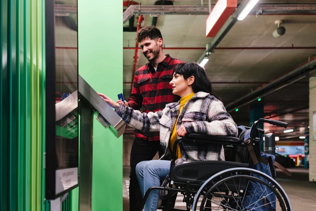
We see accessibility as design logic, not as a checkbox.
Accessibility isn’t a filter to apply at the end, it’s the framework everything sits on.
We treat inclusive design as system logic. Adaptive touch zones, automatic high-contrast themes, voice and tactile feedback. These aren’t optional extras, they’re expressions of thoughtful engineering.
When accessibility is built in from the first sketch, the experience becomes universally natural. Everyone simply feels that it just works.
We see precision at a pixel level.
Wayfinding might look visual, but it’s spatial mathematics at its core.
Every 3D render, path curve, and camera tilt is grounded in geometry, ensuring scale fidelity, sightline accuracy, and perspective that matches how people actually see.
A one-degree misalignment on a 3D model can make a hallway feel longer than it is and a mislabelled zone can create phantom confusion. The precision we obsess over is invisible, but it’s the difference between orientation and disorientation.
When you get geometry, physics, and psychology working in unison, you get wayfinding that feels right before you even realise why.
We see connection. Not between screens, but between systems.
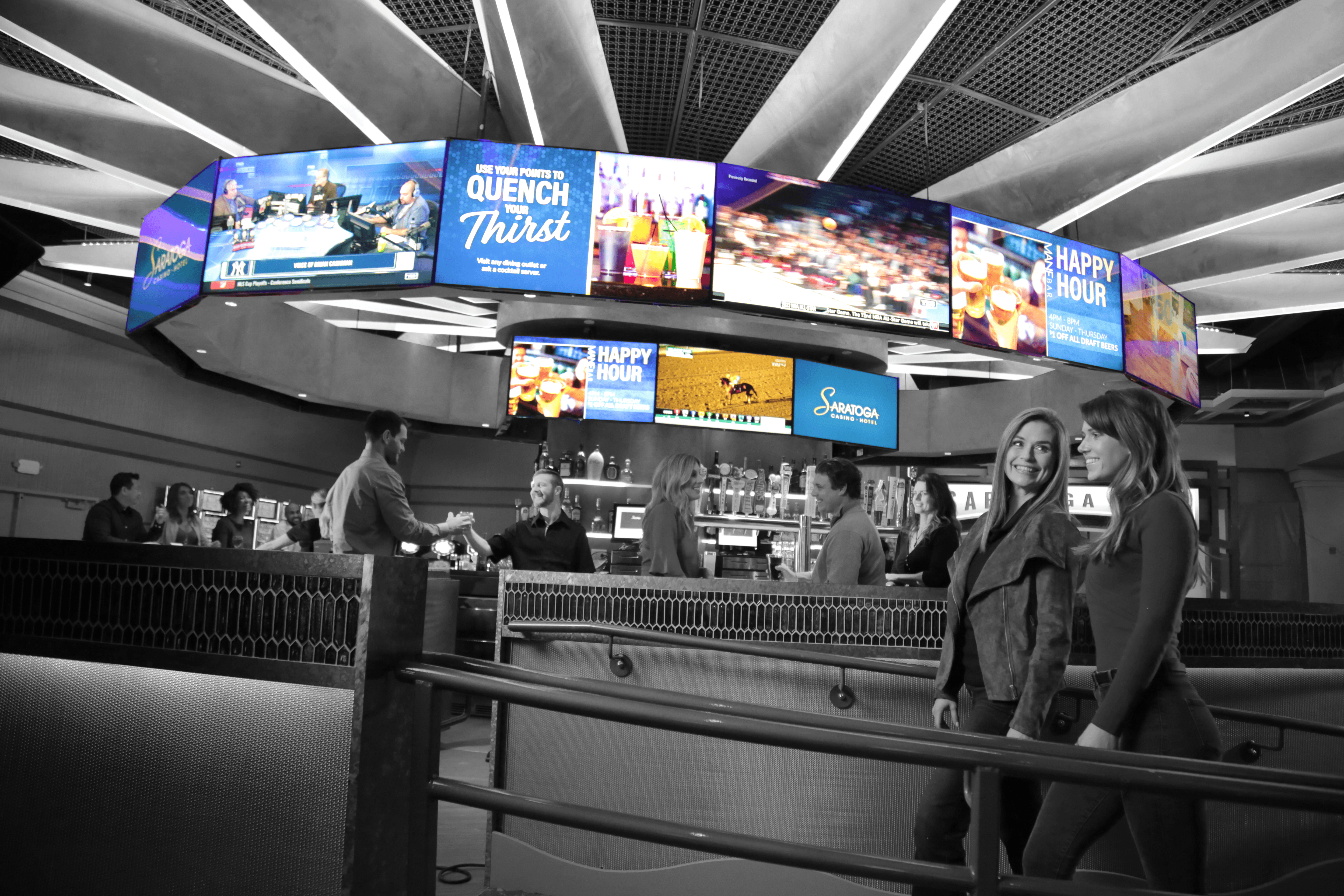
An interactive map rarely stands alone. It’s part of living connected space infrastructure: digital signage, content management, sensors, and scheduling systems, all updating in sync.
That integration work is invisible to users but critical to operators. If an event changes, signage shifts automatically. If a venue closes an area, route logic recalibrates across every kiosk instantly.
It’s what ensures that what users see on-screen reflects what’s happening in the physical world, precisely, every time.
Conclusion
When we say “what we see that you don’t,” we’re talking about the hundreds of invisible details that define the user experience long before a finger touches the screen.
We see geometry in pixels, emotion in orientation, data in motion, and the subtle alignment of them all.
Because true wayfinding isn’t about showing the way.
It’s about designing a world where people never feel lost.
If you’d like to explore what invisible design could do for your space, we’d love to share what we see. Book a friendly chat with our team about your connected space infrastructure.
what's next
Want to know more?
Book a consultation with our experts
By submitting this form you agree to our terms.